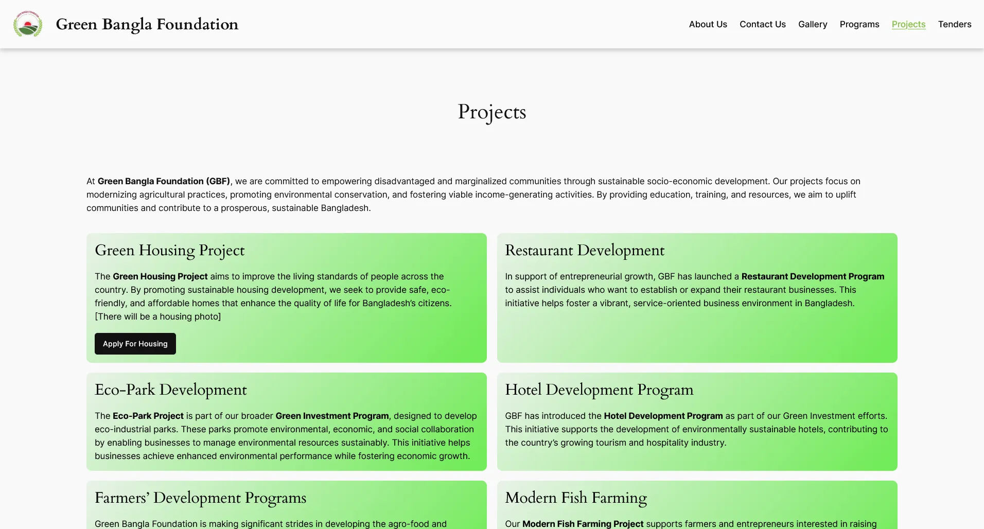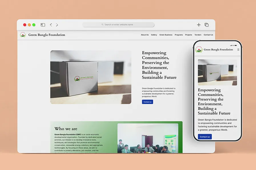
A speed-first WordPress build
The Green Bangla Foundation needed a new site fast, on a tight budget, after their old one was hacked. The old site ran 17 plugins, 8 of which had known vulnerabilities flagged by a WPScan audit. Its Lighthouse scores reflected the bloat: 31 on mobile speed, 44 on desktop. I built the replacement on WordPress using Gutenberg Full Site Editing (FSE) and almost no plugins, then tuned it by hand. The result: 100 for speed, accessibility, and best practices on Google Lighthouse. 83 for SEO. Total project time was 11 working days, and the budget came in roughly 60% below the nearest rebuild quote the client had received.
Key Takeaways
- The old site ran 17 plugins with 8 known vulnerabilities; Lighthouse mobile speed was 31 before the rebuild.
- A lean WordPress build with Gutenberg FSE and almost no plugins brought that to 100 for speed and accessibility in 11 working days.
- Most of the score gain came from cutting plugins and optimizing images, not adding a caching layer.
Why so few plugins?
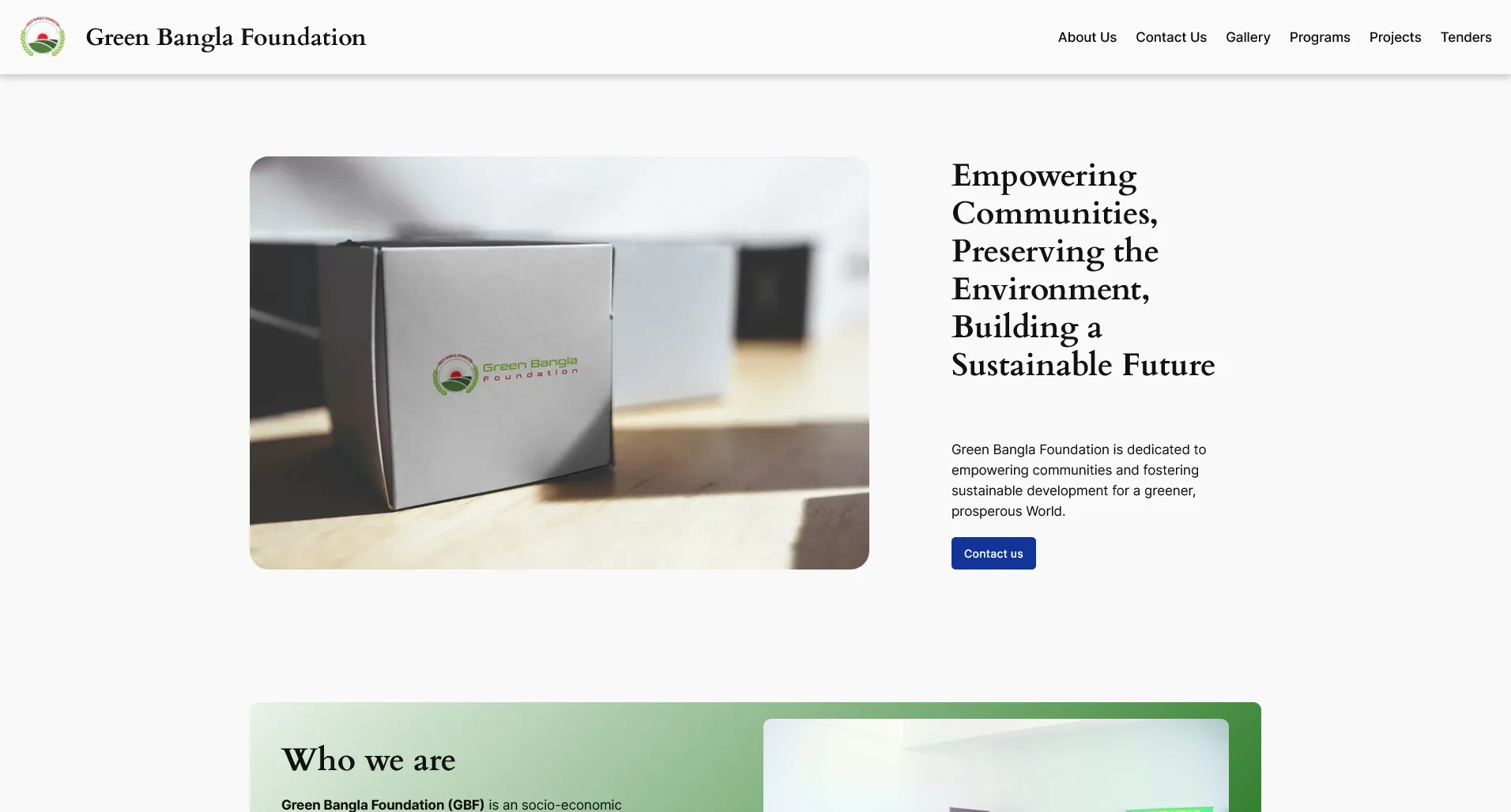
Every plugin is code the browser has to download, parse, and run. The old site had been hacked. A bloated plugin stack is the kind of attack surface that invites trouble. So I kept the dependency list short. Gutenberg FSE handled layout. CSS handled the rest. Fewer moving parts meant a lighter page, a smaller attack surface, and a site the client could actually manage themselves without help.
How I hit a perfect speed score
Page speed is one of the few ranking factors Google has confirmed outright. It was the first thing I optimized for. The desktop build came back at a perfect 100.
Desktop PageSpeed Insights
I measured both versions with Google PageSpeed Insights. Here’s the desktop result:
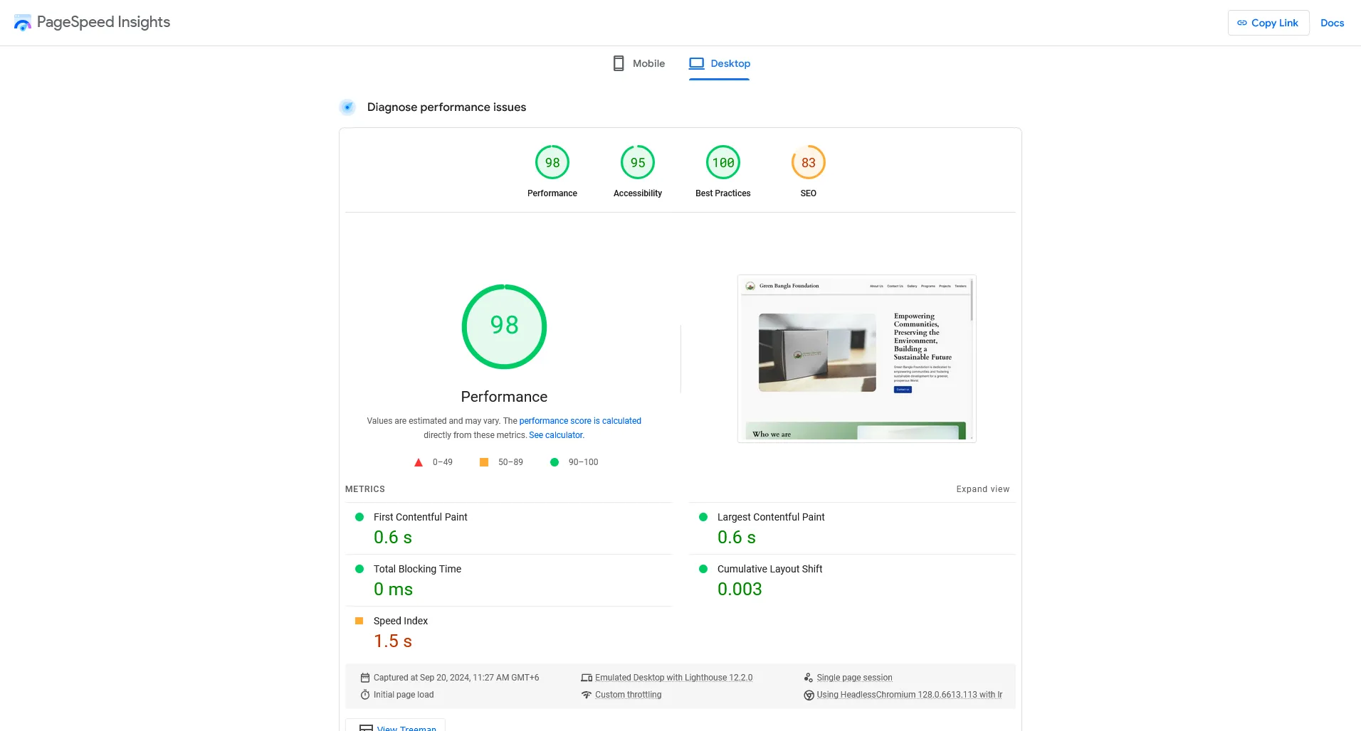
A score of 100 means the page loads with almost no wasted work. No render-blocking scripts. Properly sized images. Clean markup. For a visitor, it just feels instant.
Mobile speed is the harder one
Desktop is easy. Mobile is where most sites fall apart, and it’s where most of the traffic is. A slow mobile page bleeds visitors before they even see the content.
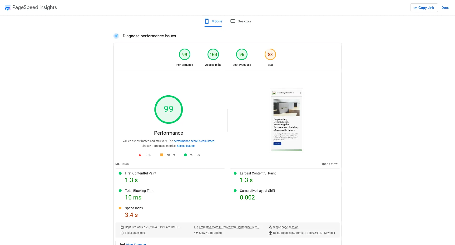
The mobile build held up well. I designed mobile-first and kept the same lean approach, so the experience stays quick whether someone arrives on a phone or a laptop.
What it shipped with
Google indexes the mobile version of a site first. Get mobile wrong and you’ve sabotaged your rankings before you’ve written a word of content. The Green Bangla Foundation site pairs high performance with a content setup the client can run themselves through WordPress and Gutenberg FSE. It shipped on a tight budget and a tight timeline without cutting corners on speed or usability.